As you know, each framework has its advantages and disadvantages, you have to choose wich your own framework you will use for your projects after determining requirements & analysis, in other words, suit your needs, CSS frameworks are very incredible because they make your website very responsive and practical .
Criteria You Should Know Before Choosing a CSS Framework
Structure data.
depends on the kind of CSS system does your site need.
added new classes for example .table-success .table-danger, .table-info
Bootstrap Images.
Responsive images: images in Bootstrap are made responsive with .img-fluid. max-width: 100%; and height: auto; are applied to the image.
Image thumbnails: You can use .img-thumbnailto give an image a rounded 1px border appearance.
Bootstrap Alerts.
Alerts provide feedback messages to user,Bootstrap offers differents classes specialy for alerts for example,.alert-primary,alert-secondary,alert-success,alert-danger,alert-warning,alert-info,alert-light,alert-dark .
These classes are available also for links.
Bootstrap Buttons.
Bootstrap allows different classes for custom button styles for actions in forms, dialogs and more with support for multiple sizes, states
Semantic UI is a front end framework like Bootstrap and Bulma, Semantic UI offer components more interaction than Bootstrap, in addition, these components have richer behaviors and extensibility
Why use it.
Easy of use.
Semantic UI is very easy to use compared with other frameworks.
Intuitive Javascript
Semantic uses behaviors that trigger functionality.
Easy to install.
Based on NodeJS and Gulp , they are very easy to install wich facilitates installation on developers.
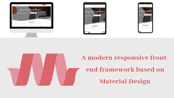
Materialize CSS is a front end framework based on Material Design, is used to create responsive websites and provides rich layouts, animations, many powerful UI.
Features of Materialize CSS.
provide materialize CSS templates.
based on CSS,HTML and Javascript.
helps in constructing attractive, consistent and functional web pages and web apps
in-built responsive design.
Advantages of Materialize CSS.
Responsive Design.
Materialize will redesign itself as per the device size.
Materialize classes are created in such a way that the website can fit any screen device.
Extensible.
Materialize is by design very minimal and flat it is designed considering the fact that it is much easier to add new CSS rules than to overwrite the existing CSS rules. It supports shadows and bold colors. The colors and shades remain uniform across various platforms and devices
Why do developers choose Bootstrap?
Responsiveness
UI components.
Consistent.
Great docs.
Flexible.
HTML, CSS, and JS framework.
Open-source.
Customizable.
Mobile first.
Popular.
Why do developers choose Materialize CSS?
Responsive
Easy to use.
Modern looks
Open source.
Good documentation.
Code examples.
Flexible.
It looks beautiful.
Great Grid System.
Easy setup.
Conclusion
CSS frameworks focused on responsive web design aspects, otherwise, these CSS frameworks cover all area of responsive web development, a good CSS framework may contain many options like user interface, layouts, grid system, responsive tables, etc.
On the other hand, all CSS frameworks are best and powerful, but choosing any one of them depends on what you need.
